
Quick Read
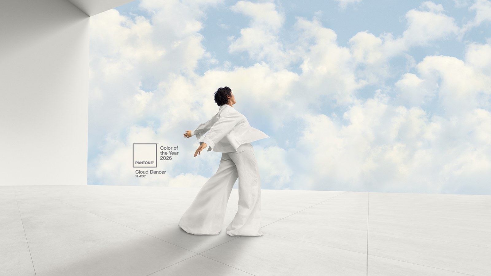
- Pantone named ‘Cloud Dancer’—a billowy, balanced white—as its Color of the Year for 2026.
- The color represents serenity, new beginnings, and a desire for quiet reflection in a fast-paced world.
- ‘Cloud Dancer’ has equal cool and warm undertones, avoiding sterility while embracing authenticity.
- The shade is already influencing fashion and interior design, seen in natural fabrics and materials.
- Pantone’s annual color selection reflects broader cultural and societal trends.
Pantone Unveils ‘Cloud Dancer’ as 2026’s Defining Shade
Every December, the Pantone Color Institute’s announcement of its Color of the Year is more than just a headline—it’s a reflection of the cultural pulse and the hopes we carry into the next twelve months. For 2026, Pantone has chosen ‘Cloud Dancer’, a shade of white described as “billowy” and “balanced”, aiming to capture the spirit of serenity that many seek as society grows ever more frenetic.
Why ‘Cloud Dancer’? A Color for Reflection and Renewal
Leatrice Eiseman, Pantone’s executive director, explained to CNN that the choice of ‘Cloud Dancer’ was no accident. In a time when technology increasingly shapes our lives and distractions abound, this color serves as a visual anchor—a gentle reminder to slow down and rediscover the value of calm and quiet reflection. Eiseman noted, “Cloud Dancer represents a calming influence in a frenetic society, rediscovering the value of measured consideration and quiet reflection.”
The institute’s vice-president, Laurie Pressman, emphasized the importance of the color’s name. “The color name is critical. The minute you hear a name describing color, you instantly conjure up an image,” she said. ‘Cloud Dancer’, with its poetic undertone, evokes imagery of lightness, movement, and possibility—a fresh start embodied in a hue. The team sifted through cultural, political, and style references before settling on this particular shade, paying special attention to its “equal balance of cool and warm undertones.”
The Power and Subtlety of White in Fashion and Design
White isn’t new to fashion or interiors, but Pantone’s choice is about nuance. Not every white is equal: Pressman cautioned that a brighter, colder white might have suggested sterility or isolation, while ‘Cloud Dancer’ was selected for its “natural feeling and honesty.” Eiseman added that this shade pairs well with natural textures—think feathers, wood, and stone—reflecting a trend toward authenticity and comfort.
These influences are already visible. At the 2025 Met Gala, Diana Ross’s sweeping 18-foot feathered train captured the ethereal quality of ‘Cloud Dancer’. Emma Stone’s Louis Vuitton bubble-hem dress at the Venice Film Festival and Rosalía’s floaty white ensembles during her “Lux” album promotions all echoed the light, airy spirit the color embodies. In home decor, Eiseman describes ‘Cloud Dancer’ as offering “clarity without coldness, structure without severity,” pairing effortlessly with organic materials for spaces that feel both pure and inviting.
How Pantone’s Color of the Year Shapes Trends
Pantone’s annual color selection doesn’t just follow trends—it helps set them. Since 1999, their choices have reflected not only shifts in style but also broader cultural moods. The process involves deep research: experts monitor everything from fashion runways and film to social movements and global events, searching for a color family that resonates with the times. After pinpointing the family, they refine the exact shade and name, understanding that both elements carry weight in how the color will be received.
Recent choices have shown Pantone’s sensitivity to changing moods. The 2025 pick, ‘Mocha Mousse’, was a mellow brown signaling comfort and warmth—perhaps a response to turbulent times. In 2024, ‘Peach Fuzz’ was chosen for its peace and serenity, a soft hue reflecting gentleness. This year’s selection, a tranquil white, is a continuation of this narrative: a communal longing for clarity and renewal.
The Broader Significance: Color as a Cultural Mirror
Color is more than aesthetic. It’s a language that communicates emotion, intention, and even societal values. Pantone’s choices have become shorthand for broader conversations about where we’re headed. Eiseman’s observation that ‘Cloud Dancer’ “signifies our desire for a fresh start” feels especially poignant as people worldwide grapple with change, uncertainty, and the quest for balance.
The influence of Pantone’s Color of the Year extends into branding, marketing, and product design. Companies often incorporate the chosen color into their offerings, from clothing lines to packaging, subtly weaving the collective mood into everyday life. The annual selection is both a forecast and a gentle nudge, encouraging us to embrace the qualities the color represents.
For 2026, the message is clear: after years of intensity, the world is ready for a breath of fresh air, a return to simplicity, and the kind of gentle optimism that only a soft, balanced white can evoke. As Pressman put it, “Cloud Dancer is clarity without coldness, structure without severity.”
Pantone’s selection of ‘Cloud Dancer’ as the Color of the Year for 2026 is not just a trend forecast—it’s a cultural signal. In a world marked by rapid change and digital overload, this billowy white invites reflection and renewal, suggesting that sometimes, true progress begins with a quiet pause and a clean slate.